HCI project hands-on
Many hardcore coders look down on user-interface designers because that work is not ‘really’ computing. Apart from a general lack of respect, such assumptions are downright false.
Introduction
The current project is to make programmer aware that a good usability experience starts with proper coding. A faulty machine is a nuisance irrespective of the slick interface, the VR goggles, or the high-resolution touch screens. The second thing you should become aware of is that coding the user interface takes usually ⅓rd of your programming effort and also this code should be flawless. Otherwise, dissatisfied clients. And you out of business pretty quickly.
People rely on you and your logics when they use your application in a daily situation. They are focused on their tasks (e.g., open-heart surgery, flying an airplane, teaching autistic children) and not on your code. Hick-ups in your work harm their performance. So you better create excellent user interfaces and should not treat interfaces as a frivolous byproduct.
To show you what people may use my code for, I design this HCI project that helps to learn primary school children to rehearse the multiplication tables (1 x 2 = 2, 2 x 2 = 4, etc.):
Tecnology routes
First Stage
Find stakeholders
I create a user interface for children. Make a list of the tasks they have to perform when learning the multiplication tables. What do children need to practice? The interface could be a robot but does not have to be. It could also be a game, or… whatever helps them to learn. I look what is out there on the Internet and design something of my own. Go to the stakeholders (children, parents, teachers) and interview them (at least one of each): what do they need, what would they prefer? You can do the interviews online. Show them examples (a real app, a ppt with pictures, a cardboard mock-up) and let them reflect on it.
User requirements (children):
I interviewed my twin cousins, who had just learned multiplication at a young age. First, they told me that the teacher taught multiplication tables by having them memorize and then write them silently at school. Those who couldn’t do it could be punished with detention. “ We hated memorizing the multiplication tables, it was hard and boring to memorize so many multiplication equations at once, but we hated detention even more because then we couldn’t go home and watch TV.”
I asked them if I could create an interface for them, maybe a game or anything that would help them learn, and what kind of interface they would expect. They first thought of a game they could play with two people, which was a great idea as they both do everything together all the time. When I asked if they preferred a co-op type or a competitive two-player game, the ladies thought that a competitive game would be more engaging for them.” But mum won’t let us play on the computer. Can we play your game on our mum’s phones?”
So, the ladies’ requests were: a two-player competitive mobile game that would help them learn multiplication. Secondly, the game would help them memorize the multiplication tables so they could pass their school tests and get the ladies home on time to watch TV. Finally, it had to be fun enough to keep the ladies engaged.
My design
I have designed a simple two-player mobile game for children.
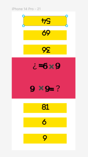
In the original design, the screen was split in half down the middle, and the two players had to sit opposite to play. The question is displayed in the middle, and the options are underneath the question. The player had to choose the correct one of the three options.
I implemented a rudimentary game interface for this idea first to ask if it met the children’s needs. Expectedly the children told me that the interface was too simple and ugly for them to engage with, but happily, they approved of the game format. They were looking forward to sitting on either end of the phone to decide on the winner, but the rudimentary model could not also count the score and announce the winner. Finally, the children had an interesting request for the time and power status bar to be displayed correctly during the game. Although I told them I could add a time module to the interface if they needed to see the time, they still felt the status bar was necessary as they were used to seeing the time there.
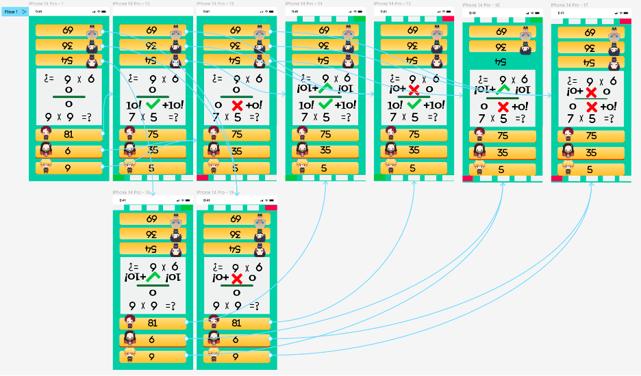
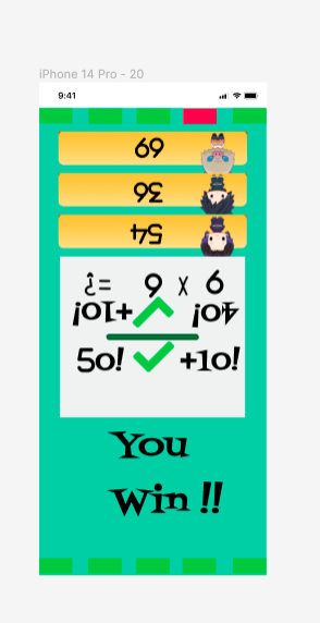
After re-analyzing the children’s needs, I redesigned the game’s interface, adding some cartoon characters and more natural background color to keep the children engaged. The status bar and winning mechanism was also implemented, with incorrect answers turning the small box at the bottom of the screen red and not rewarding the player with a score, and correct answers turning green and rewarding the player with ten points. The team with the highest score after answering all five questions will be declared the winner of the game.
Children can gradually memorize the multiplication formulae repeatedly in competitions, as the questions generate two random numbers from 1-10 to multiply together, and only by familiarising themselves with all the multiplication formulae in the multiplication tables can they increase the player’s probability of winning. This satisfies the children’s requirements.
Technical specifications:
The UI interface is designed and implemented in Figma, the core code is written in python and the game mechanics code is written in pseudo-code.
My implementation):
class GameInterface(){
var user1index := 1
var user2index := 1
var user1score := 0
var user2score := 0
var num1, num2, answer, option1, option2:integer
var user2num1, user2num2, user2answer, user2option1, user2option2:integer
var user1button = [buttonimage1, buttonimage2, buttonimage3]
var user2button = [buttonimage4, buttonimage5, buttonimage6]
var background = backgroundimage
Function selectAnswer(){
Index := index + 1
If the correct option for user 1 is pressed:
Show user1 correct image
Show user1 “+10!” image
user1score := user1score + 10
else if the wrong option for user 1 is pressed:
Show user1 incorrect image
Show user1 “+0!” image
Store num1*num2=answer in errorBook
if the correct option for user 2 is pressed:
Show user2 correct image
Show user2 “+10!” image
user2score := user2score + 10
else if the wrong option for user 2 is pressed:
Show user2 incorrect image
Show user2 “+0!” image
Store num1*num2=answer in errorBook
If the user1index and user2index greater than or equal to five:
If the user1score greater than user2score:
Hiden user1button
Show user1 “YOU WIN!!” image
Show user1 “REPLAY”image
Read user1totlescore from user1totlescore
user1totlescore:= user1totlescore + user1score
Store user1totlescore in user1totlescore
Store “user1 win” in gameResult
Else if the user1socre smaller than user2score:
Hiden user2button
Show user2 “YOU WIN!!” image
Show user2 “REPLAY”button
Read user2totlescore from user2totlescore
user2totlescore:= user2totlescore + user1score
Store user2totlescore in user2totlescore
Store “user2 win” in gameResult
Else:
Show new user1 random question
Show new user2 random question
if user1index smaller than five:
Show new user1 random question
if user2index smaller than five:
Show new user2 random question
If the “REPLAY”button be pressed:
Run replay()
}
Function replay(){
var user1index := 1
var user2index := 1
var user1score := 0
var user2score := 0
Show new user1 random question
Show new user2 random question
}
}
User requirements (children’s parent):
The children’s parent, my aunt, wanted to view the results of last three game in her interface so that she could see which children needed to improve their multiplication table skills and which ones deserved praise.
My design:
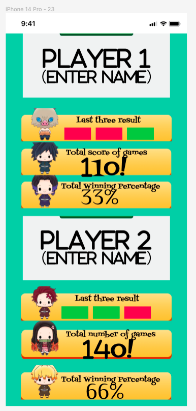
Three green squares represent the last three games for victory or red squares for defeated, not only that but also the total game score and win rate. This fulfills the parents’ requirements.
Technical specifications:
The UI interface is designed and implemented in Figma, the core code is written in python and the game mechanics code is written in pseudo-code.
Image source: https://store.line.me/stickershop/product/20102/zh-Hant
My implementation (prototype application/code):
Class parentInterface(){
Var backGround := ParentInterfaceBackGroundImage
Var user1name := “PLAYER1”
Var user2name := ”PLAYER2”
Read user1totlescore from user2totlescore
Read user2totlescore from user2totlescore
Read gameSessions from gameResult
Read user1winTimes from gameResult
Read user2wintimes from gameResult
user1button = {hide,hide,hide}
user2button = {hide,hide,hide}
Function lastThreeResult(){
j := 0
For I := 0 to 3:
If user1 win:
user1button[j] := green
user2button[j] := red
else:
ser1button[j] := red
user2button[j] := green
j := j + 1
}
Function showTotelScore(){
Show user1totlescore
Show user2totlescore
}
Function showWinRate(){
user1WinRate := user1WinTimes/gameSessions
user2WinRate := user2WinTimes/gameSessions
Show user1WinRate
Show user2WinRate
}
Function enterPlayer1Name(){
User1name := user input
Hiden user1“(ENTER NAME)” image
}
Function enterPlayer2Name(){
User2name := user input
Hiden user2“(ENTER NAME)” image
}
}
User requirements (children’s teacher):
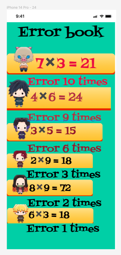
The children’s teacher said it would be helpful if the interface could generate an error book to save the questions on which the children often make mistakes so that he can be more aware of which questions are prone to errors.
My design:
On the teacher’s screen, the game saves the children’s incorrect questions and displays the top six in order of the number of errors. The top three questions with the most mistakes will, in turn, become more significant and redder, giving excellent responses to the teacher on the questions where the children are most likely to make mistakes.
Technical specifications:
The UI interface is designed and implemented in Figma, the core code is written in python and the game mechanics code is written in pseudo-code.Image source: https://store.line.me/stickershop/product/20102/zh-Hant
My implementation (prototype application/code):
Class teacherInterface(){
Var backGround := teacherInterfaceBackGroundImage
Function readErrorHistoryTimes(){
Read errorHistrory from errorBook
Var errorHistroryTimes[length[errorHistrory]]
For i := 0 to length[errorHistrory]:
For j := 0 to length[errorHistrory]:
If errorHistory[i] is equivalent to errorHistory[j]:
errorHistoryTimes[j] := errorHistoryTimes[j] + 1
else:
errorHistoryTimes[i] := 1
}
Function sort(errorHistory , errorHistoryTimes){
Var top1ErrorTimes, top2ErrorTimes, top3ErrorTimes, top4ErrorTimes, top5ErrorTimes, topErrorTimes 6 := 0
Var top1str, top2str, top3str, top4str, top5str, top6str
For i := 0 to length[errorHistoryTimes]:
If top1 greater than errorHistoryTimes[i]:
If top2 greater than errorHistoryTimes[i]:
If top3 greater than errorHistoryTimes[i]:
If top4 greater than errorHistoryTimes[i]:
If top5 greater than errorHistoryTimes[i]:
If top6 greater than errorHistoryTimes[i]:
Else:
top1ErrorTimes := errorHistoryTimes[i]
top1str := errorHistory[i]
else:
top2ErrorTimes := errorHistoryTimes[i]
top2str := errorHistory[i]
else:
top3ErrorTimes:= errorHistoryTimes[i]
top3str := errorHistory[i]
else:
top4ErrorTimes := errorHistoryTimes[i]
top4str := errorHistory[i]
else:
top5ErrorTimes := errorHistoryTimes[i]
top5str := errorHistory[i]
else:
top6ErrorTimes:= errorHistoryTimes[i]
top6str := errorHistory[i]
show top1str,top1ErrorTimes
show top2str,top2ErrorTimes
show top3str,top3ErrorTimes
show top4str,top4ErrorTimes
show top5str,top5ErrorTimes
show top6str,top6ErrorTimes
}
}
Count
Now count all the lines of code I used to create an interface for my user groups. Express in percentages: How much programming was dedicated to the core code of multiplication and how much to the various interfaces.
The core code is 4 lines long, which is 2.42% of the total code.
Interface 1 code is 65 lines long, which is 39.39%
Interface 2 code is 41 lines long, which is 25.85%
Interface 3 code is 55 lines long, which is 33.33%
Conclusion
Coding the user interface is tougher than programming the core code, this is because the needs of new users can often have a significant impact when writing interactions. For example, in this assignment, when I asked the teachers and parents for requirements after completing the children’s game interface, they needed to be able to view the error book or be able to view the results of the game. It was necessary to write a new interface for new users and add a module to the completed children’s game interface to store data that new users would like to see, such as the scores the children got or the mistakes the children often made, without any changes to the core code. As you can imagine, as the number of users increases, the new needs of new users will create a significant amount of programming work for HCI compared to the core code.
Programmers can use time complexity, package size, algorithm runtime, and console output to ensure that their core code runs correctly and efficiently and produces the expected results when coding the core. However, in HCI programming, the programmer often does not know if the result is what the user wishes, as the user often does not know what they expect. It is challenging to ensure that the designed interface is efficient. The need described to me by the children’s parents in this assignment was vague and abstract: “I want to know how well the children are doing and how well they have mastered the multiplication tables.” How to measure “how well” and “mastery” and display them on the interface is much more complex than printing the multiplication on the screen. Programmers often have to stop and think, “is this what the user wants.”
Secondly, what makes HCI programming more challenging than core code programming is that errors are difficult to detect and correct. For example, in the second question of this assignment, to find a bug in the code of the topic, I could first try to run the code by copying the string into the compiler. The compiler would immediately report the error to me after a failed compilation, e.g., the return type of the function in line 8 is not int, a semicolon is missing at the end of line 10, etc. Even after the compilation had produced the output, I could determine the for loop condition in the program by looking at the output. Even when it compiles and produces output, I can tell by looking at the output that there may be an error in the for loop condition, as the output produced is not what was expected.In summary, the compiler and programmer’s judgment can find and correct most errors in core code programming. However, this was not the case in HCI programming, and it was not until a final check in this assignment that we discovered that the scores in the game screen designed for the children did not display appropriately whether the children answered the questions correctly or incorrectly and that the scores did not change, but remained at 0. Neither the children nor the parents nor even I noticed this problem until we were trying to implement the parent’s attempt to find out whether the children. The problem was only discovered when a new score-saving function was added to the then completed game screen when parents wanted to know if their children were “doing well,” as the green or red squares at the ends of the screen also represented wins and losses so that users may have inadvertently overlooked the problem. In any case, since the compiler cannot detect such invisible bugs, HCI programmers may not notice any errors in their design. So compared to core code programming, which can be seen with a precise machine and has accurately described output for reference, HCI programming efforts suffer from errors and flaws that are difficult to notice.
Finally, the workload of HCI programming is not less than that of core code. Before this assignment, I also thought that the work of HCI programming should be easy and romantic. Still, after interviewing users repeatedly, I found out that the work of HCI programming is also very complex. For example, at the beginning of the design process, there was a lot of interviewing of users to get their requirements, then analysis of their requirements to try to design an interface that would meet their needs, after which a lot of pseudo-code had to be written to implement the designed interface, which was much more complex than expected. Many of the designed interfaces had to be cut. User requirements had to be compromised, and the core code to generate the multiplication tables was even then. Even so, the core code for generating the multiplication tables was only two percent of the total code, which shows that the coding workload for HCI programming is heavier than for core programming.
HCI project hands-on